Collapsible container
You can achieve collapsible functionality for a single element or for a container with multiple elements inside. These are also referred to as fold-out boxes, collapsible elements or containers, accordion, open/close elements, etc.
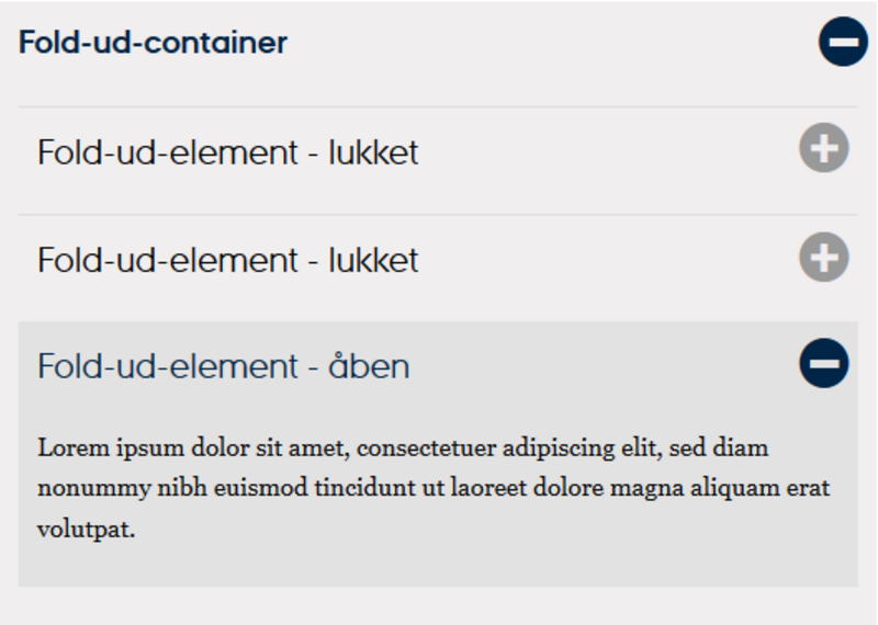
When you need to provide users with an overview of a large amount of content, you can use collapsible elements. You can choose whether the element should be opened or closed by default. When the element is closed, only the heading is visible while the content is hidden when the page is opened. It requires an extra click for the user to access the relevant content when the element is expanded; however, it allows for a quick overview if a page contains a lot of content.
How to Do It
There are two different ways to create collapsible elements:
1. Using a collapsible container
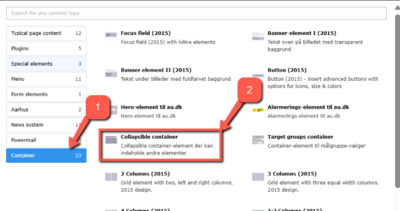
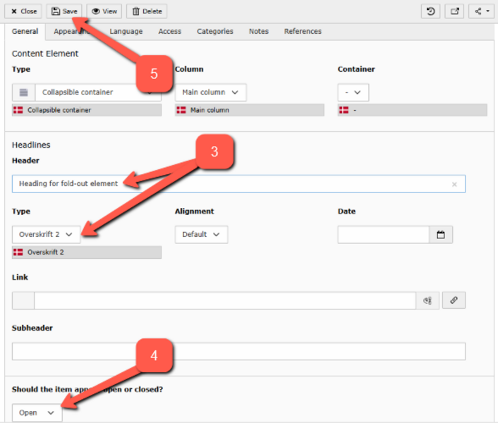
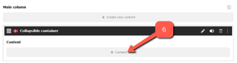
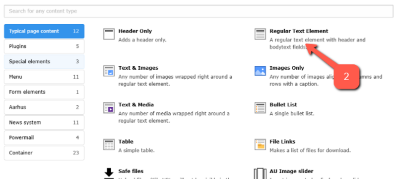
If you choose a collapsible container you can place the elements you need inside it — grouped together in one container. You can find the collapsible container under the container tab (view Embed new element). This method is useful if you want more than one element inside your collapsible container.
2. Enabling collapsible functionality for individual elements
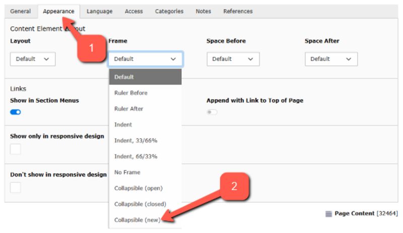
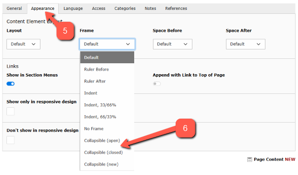
Alternatively, you can enable collapsible functionality for Text or Text & Images elements individually. You do this in the Appearance tab of the element, as shown below. This method is suitable if you only have one element that needs collapsible functionality.

Link to a collapsible container element
Link to a collapsible container element
Combine collapsible containers with collapsible elements
Combine collapsible containers with collapsible elements
It is possible to place one or more collapsible elements inside a collapsible container. To ensure the solution is not too cumbersome, a special design has been developed where closed collapsible elements are not displayed in boxes but are instead outlined with a thin line.