Neutral containers
What are neutral containers?
Neutral containers are multifunctional and can be used in many different contexts. A neutral container is a type of invisible holder or box primarily used to store and group content, making it easy to style or copy to other pages. If you create a neutral container without content, you won't be able to see it in the frontend. A neutral container does not affect the surrounding content.
Neutral containers are primarily used at AU for two purposes:
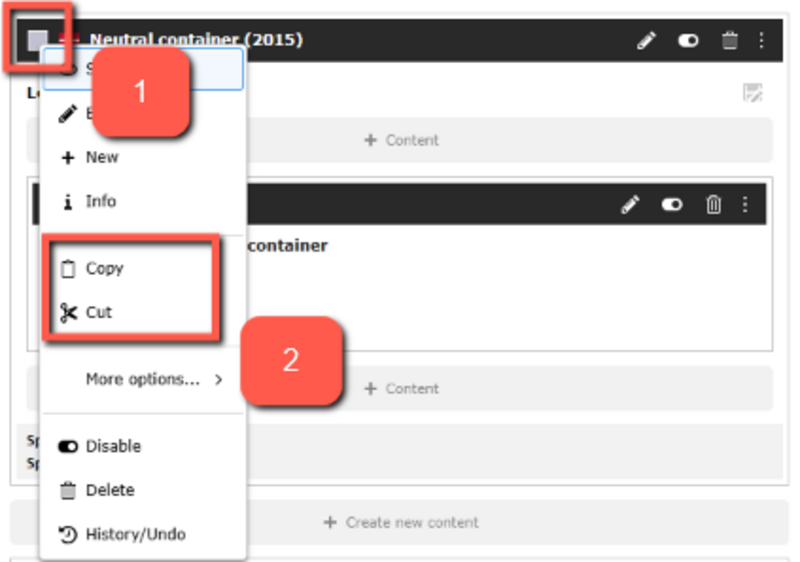
- To group multiple elements that need to be moved or copied at once or used as global content. The neutral container functions like a section or a <div>, if you're familiar with HTML. When you group elements in a container, it becomes much easier to copy or move several elements to new or existing pages. If a neutral container surrounds the elements you want to move or copy, you can simply copy the neutral container, and the rest will follow automatically.
- To add background colors and styling. When you create a neutral container on your page, you have the option to select from a range of background colors. If you need to highlight an element on your page or make something visually distinct, it is ideal to build the content elements into a neutral container. The colors are fixed, so you cannot create your own custom color.
In this guide, we will go through how to create a neutral element, how to copy or move it and how it can be styled.
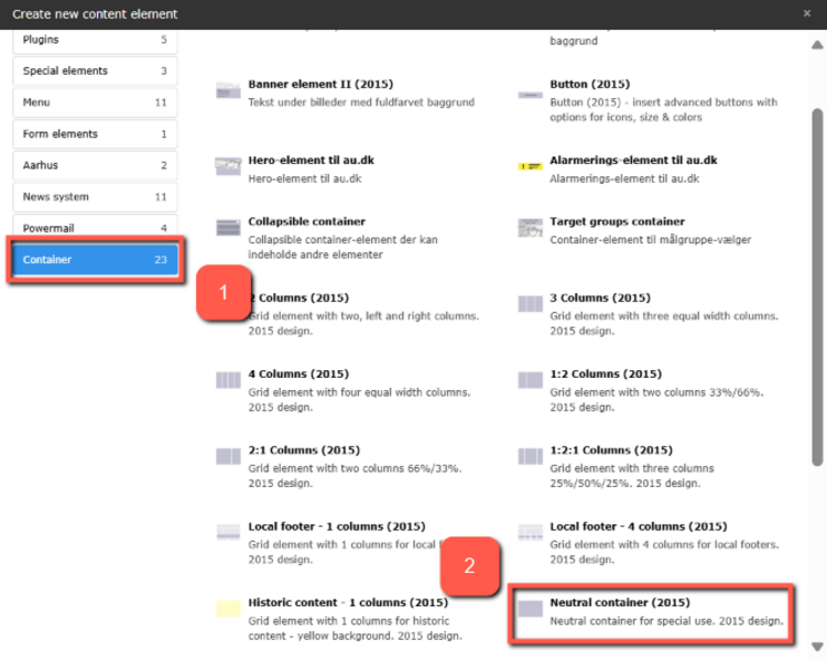
Create a neutral container
Create a neutral container
How to style neutral containers
How to style neutral containers
You can use the functions in the neutral container to modify the appearance of the empty element.
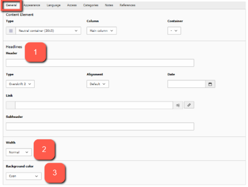
- Header: Choose a header for your element. This makes it easier to find later. The header is always hidden in the front-end.
- Width: You can choose to adjust the width of your element. Normal gives you the same width as other elements within your margin. Expanded gives the element more margin, making the text/images more centered. In the first row of examples at the bottom of the page, you can see the difference between the two options.
- Background color: Here, you can choose whether the element should have a background color. You can select from different colors but cannot add your own color via code. You can see examples of the colors at the bottom of this guide.
You can also change the appearance of the elements you create inside the neutral container under the Appearance tab for the specific element — see the examples further down the page. Note that the settings do not affect the neutral container itself; they only affect the elements inside the container (e.g., text elements).
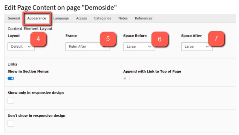
4. Layout: This feature has no function when working with neutral containers.
5. Frame:
- Ruler Before: divider line before your content
- Ruler After: divider line after your content
- Indent: Indentation on the element. 33/66% shifts the text to the right, creating a margin on the left side. 66/33% shifts the text to the left, creating a margin on the right side.
- Collapsible: Cannot be used on neutral containers.
6. Space Before: Increases the top margin, pushing the text further down in the container.
7. Space After: Increases the bottom margin, creating more space after the text.
Examples of neutral containers with normal width
This is an example of a text element in a dark blue, neutral container. It has a normal width.
This is an example of a text element in a green, neutral container. It has normal width.
This is an example of a text element in a green, neutral container. It has normal width.
Examples of Neutral Containers with Indent of 33/66% and 66/33%
This is an example of a text element in a purple, neutral container. It has a normal width and an indent of 33/66%.
This is an example of a text element in a dark purple, neutral container. It has a normal width and an indent of 33/66%.
This is an example of a text element in a turquoise, neutral container. It has a normal width and an indent of 66/33%.
This is an example of a text element in a dark turquoise, neutral container. It has a normal width and an indent of 66/33%.
Examples of neutral containers with space before and space after
This is an example of a text element in a dark orange, neutral container. It has a normal width and small space before and space after.
This is an example of a text element in an orange, neutral container. It has a normal width and medium space before and space after.
This is an example of a text element in a red, neutral container. It has a normal width and large space before and space after.
This is an example of a text element in a magenta, neutral container. It has a normal width and extra large space before and space after.
Examples of neutral containers with ruler before/after
This is an example of a text element in a yellow, neutral container. It has a normal width and ruler before.
This is an example of a text element in a dark yellow, neutral container. It has a normal width and ruler after.