Images and graphics
Only use images and graphics if they convey something to the user and serve a purpose on your page, not just as filler or decoration.
- Consider whether it makes sense to display your graphics on, for example, a smartphone, or if they should be written as text instead.
- Always check how your images look in responsive design, if you want them to be presented in a specific way.
Functionality
To have control over how your images are presented in responsive design, we recommend uploading two versions of an image as a starting point — one for desktop viewing and one for smaller screens. In TYPO3, this can be done by showing or not showing a content element in responsive design. For example, a picture element if the existing image is not suitable for display on a smartphone.
You are probably familiar with the general guidelines for using images in TYPO3 and know that TYPO3 can automatically scale images satisfactorily to some extent. It is possible to check if your existing images work well in responsive design. This will depend on factors such as the image size, the placement of the subject, how you have defined the image display, whether it is a focal point, etc.
Cropping
It can be a bit complex to provide specific guidance on the sizes and resolution of images for the web, as your images will be displayed in different browsers and on screens with widely varying sizes and resolutions. In most cases, TYPO3 generates images in appropriate sizes. However, we recommend that your images have a maximum width of 1400 px.
Focus fields
You should always write concisely and precisely when creating text for focus areas. They are not intended for long explanations or descriptions, but simply to highlight a particular topic.
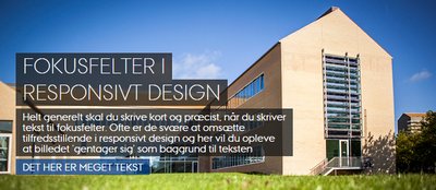
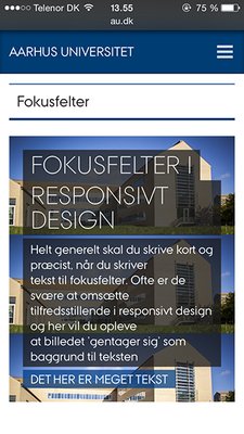
In focus areas, the image serves as a background to your text, and technically, the image adjusts to fit the text. In focus areas with too much text, the image may therefore 'repeat.' This can also happen if the page is viewed on a small screen in responsive design since the text must remain readable and therefore has a certain size. This changes the size ratio between the text and the image. Note that the focus area image is cropped from right to left in responsive design.

Focus field on desktop

Same focus area on a 320-pixel screen.
Always review your focus areas in responsive design and consider whether you need to upload another version that is only displayed in responsive design. See the description under Functionality