Page structure
Generally, there are no restrictions on how you can structure your pages with elements in TYPO3 or which content types you can use, such as text, images, and videos, when adapting your pages for responsive design. You just need to be aware of how they are presented in responsive design and possibly adjust the structure and placement of the content.
Layout
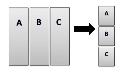
Your page content will stack from left to right when displayed on smaller screens, but it actually adapts to larger screens as well, such as a large computer monitor. When considering your content, you should primarily focus on content for smaller screens. This is also the focus of the guidance provided here.

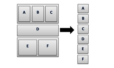
If you have divided your page into horizontal blocks, the placement of your content will look like this:

Content placement
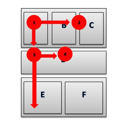
When placing your content, always position the most important information at the top and to the left. User studies show that users spend up to 70% of their time on the left side of a webpage. Additionally, eye-tracking tests reveal that users read webpages in an 'F' pattern.

This doesn’t mean that content placed in the bottom-right corner won’t be seen, but you should evaluate the order of your content. For example: What should the user do at the end of their visit? Register after reading about the event or course? In that case, it makes sense to place a registration button in the bottom-right corner.
As mentioned earlier, your content will stack from left to right when displayed in responsive design. If you follow the recommendations for content placement, the most important information will be shown first.
Collapsible container
To enhance usability on pages with responsive design, you need to consider how to compress your content. You shouldn’t provide less information, but you should do so within a smaller space.
To make text-heavy or long pages more manageable, it can be beneficial to use to use collapsible container. When the fields are collapsed, users can see your headings and get a quick overview. When the fields are expanded, users can choose to collapse them and navigate more quickly through the page.
You can also use collapsible boxes instead of creating subpages. On a page that introduces a topic — referred to here as a presentation page — you might typically see links to more detailed information on subpages. Instead, you can place the information in collapsible boxes on the presentation page. This way, you also get a shorter navigation menu, increase its clarity, and make the page more user-friendly.
Collapsible boxes should not be used solely as a layout element on a page. Their use should be balanced with the purpose. Collapsible boxes are well-suited for communicating specific information in a clear manner. Another more visual and concise way to present content on a presentation page is to use TYPO3's graphical elements.
A collapsible box is a single element where you can have text or text and images in relation to each other. You can also use a collapsible, where you can insert multiple types of TYPO3-elements together.