Design guide for news
What should you know before creating a news item in TYPO3?
News items in TYPO3 are designed with a newer design compared to the rest of our content in TYPO3, specifically using our design system Delphinus. Eventually, this design is intended to be implemented across all our websites. Since it differs slightly from the design used elsewhere, there are some design principles to follow to make the most of this design.
Video: Design guide for news
Claus presented some recommendations for the new news design at the web coordination meeting on February 24, 2022.
Recommended side layout
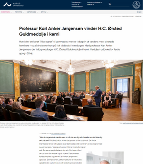
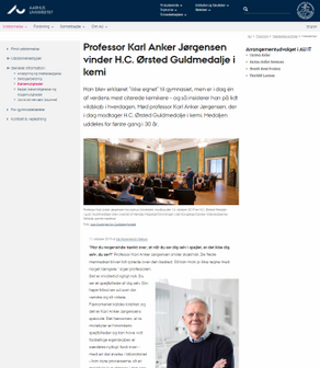
Since the news design is intended to be centered with generally larger fonts and more line spacing, a layout without right and left columns works best, meaning a full-width view for news items.
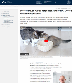
In a pinch, you may choose to have either a right OR left column if deemed necessary, but the design functions best in full width. When using content elements, do NOT use the layout with left/right columns.
We recommend:
- Full Width (Without Left / Without Right): Design-wise, full width is best for news display.
- Alternatively: With Left / Without Right
We do not recommend:
- Without Left / With Right
This layout can be used for standard news views, but should be avoided when using content elements in news items. It does not work optimally on smaller screens with content elements. Typically, you have one display page for all your news (with or without content elements), so choose either alternative 1 or 2.
Do not use this layout:
- With Left / With Right
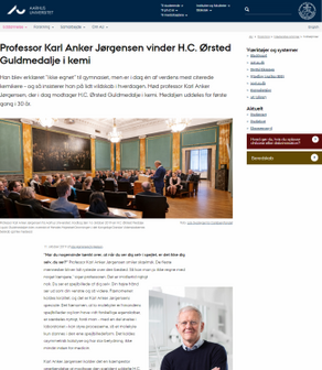
If you have news using this layout, update the display page to one of the other layouts. The design becomes too cramped and does not function optimally on smaller screens. Therefore, avoid using this layout for news.
Whether you are building your news with content elements or not, the design remains the same. Click on the screenshots below to view the full page design.
Headings
Headings should be created using the heading style in the TYPO3 editor, never with bold text.
Never use Heading 1 within the news item itself, as it is reserved for the title of the element (see image). Instead, use Heading 2 for the news subheadings.
Lists: Bullet points
Always create lists using the editor's bullet point feature, rather than just using line breaks and possibly a hyphen.
Image credit
The news module provides an option to use a specific field for crediting: Source. You can also insert a link in the source link field for crediting purposes. Therefore, please use this field for crediting and avoid placing credit information in the description field.
Don'ts with content elements
Everything you need to know about creating news with content elements can be found in the guide Building with content elements.
Do not combine content element layout with regular news text. This will result in two bylines, and the regular text will be left-aligned while content elements will be center-aligned.
News list views
There are 4 different designs for list views, and you also have the option to vary your list view so that some news items in a list can be set up to display differently from others.
You can read more about this in the Guide create news lists views > settings.


