Web design
What is web design?
When designing a page, an important consideration can be how the page's elements are structured. There are several different aspects to consider, including layout, content structure, colors, and graphics.
Your page should be aesthetically pleasing and minimally designed. This means that the website should not contain information that is irrelevant or rarely used. If there is too much text on your page, it can overshadow the most important information that the user should read.
It can be essential to ask yourself the following questions when designing your page:
- Does the page appear clear and organized?
- Is it clearly indicated in the design what is most important?
- Is the design organized and grouped in a clear and logical manner?
To gain a quick understanding of how web design works, one can utilize the principles of Gestalt psychology. The Gestalt principles are a set of rules within visual perception that describe how people naturally organize visual elements into cohesive patterns or wholes when viewing things.
The law of proximity
The law of proximity states that symbols placed near each other are perceived as being related.
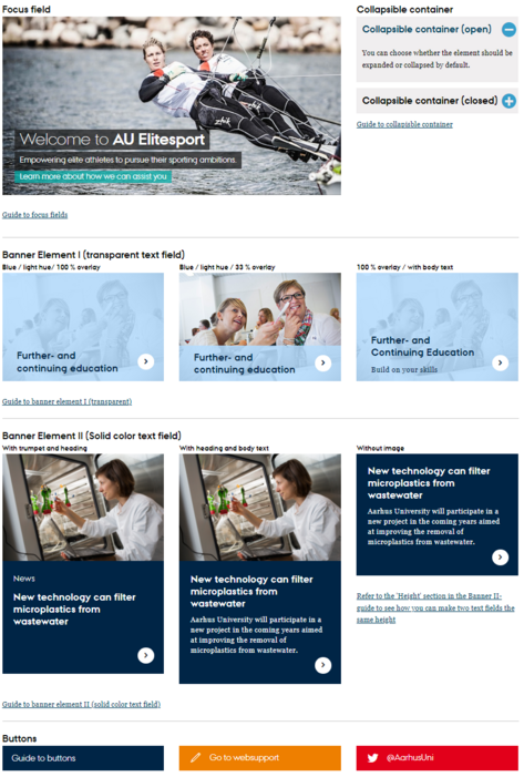
In the TYPO3 guides, the law of proximity is applied by using a divider to create spacing. This helps the reader perceive that the different elements are close to each other and related. Therefore, it can be a good idea to use a divider when you want to place items near each other or create a larger gap between different points.
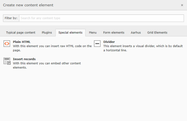
To insert a divider, you need to click on:
- Create new content element
- Special elements
- Divider
The law of similarity
The law of similarity states that symbols that resemble each other in shape, color, size, or other attributes are perceived as part of the same group.
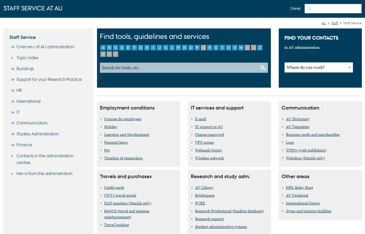
On Aarhus University's international website, the law of similarity is applied by grouping similar elements, such as links and menu items, and presenting them with the same design and formatting. For example, all buttons and text for different educational programs (Bachelor, Master, PhD) are consistent in style and placement, creating a visual coherence that helps the user perceive these as related entities. By having the box below with various job positions maintain the same color but designed differently, they are still perceived as being indirectly related, which creates an overall coherence throughout the page. Be mindful of how you use shapes and colors in TYPO3.
The law of closure
The law of closure states that symbols that are placed within the same frame are perceived as belonging together.
The law of continuity
The law of continuity states that symbols arranged in a line or a curve are perceived as related, and we naturally follow the smooth transitions.
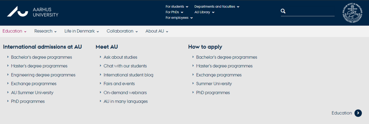
On Aarhus University's official website, there is a navigation menu where links to different sections—'Education,' 'Research,' 'Collaboration,' and 'About AU'—are placed in a horizontal line. This alignment creates a visual connection between the various sections, making it clear that they are part of the same navigation structure.
Subsections in Dropdown Menus:
When you click on one of the main categories in the navigation menu, a dropdown menu opens with subsections organized in a curve or a vertical list. This organization makes it easier for users to follow and find related content without feeling overwhelmed by a large amount of information.
By arranging elements in a line, AU creates a natural and intuitive navigation experience. This helps users understand how the different parts of the website are interconnected.


![[Translate to English:] Eksempel på en TYPO3 vejledning som benytter sig af loven om lighed](/fileadmin/ingen_mappe_valgt/AU_international.png)

![[Translate to English:] Eksempel på en TYPO3 vejledning som benytter sig af loven om forbundethed](/fileadmin/_processed_/0/8/csm_AU.dk_dee0d83971.png)
