Choose page layout
A page's appearance is determined by the selected page layout (template). To choose or change the layout, you need to edit the page property and select the appearance tab.
There are five layouts in TYPO3. Four of these can be selected by regular editors. These include with/without a left menu and with/without a right column. All layouts are responsive.

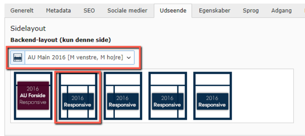
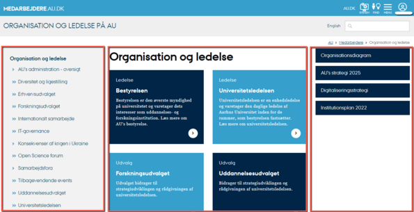
AU MAIN 2016 [Left menu, Right column]
This layout features a left menu that serves as navigation for your pages. The left menu is automatically generated as you create pages and subpages. Additionally, the template includes a right-hand column where you can place content related to the content in the main column in the center of the page.
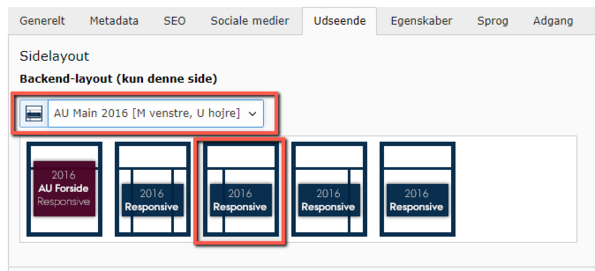
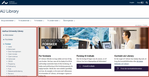
AU MAIN 2016 [Left menu, No right column]
This layout features a left menu for navigating your pages. The menu is automatically built as you create pages and subpages. The rest of the page constitutes the content column.
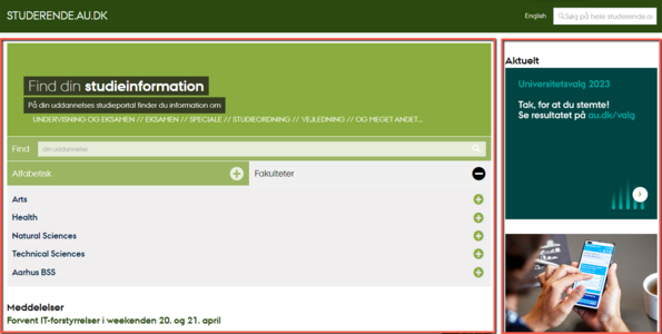
AU MAIN 2016 [No left menu, right column]
This layout has no left menu and is primarily used for homepages of web universes or portals.
When using this layout, users will not have the option to navigate to subpages via the left menu. Therefore, you should consider whether the purpose and user experience justify the use of this template.
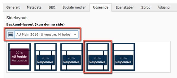
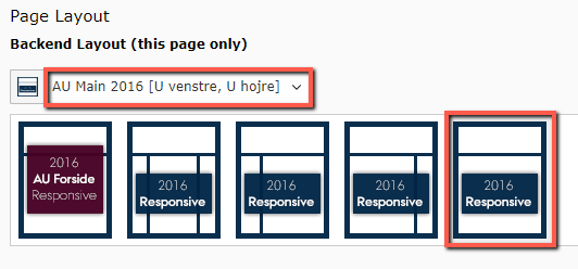
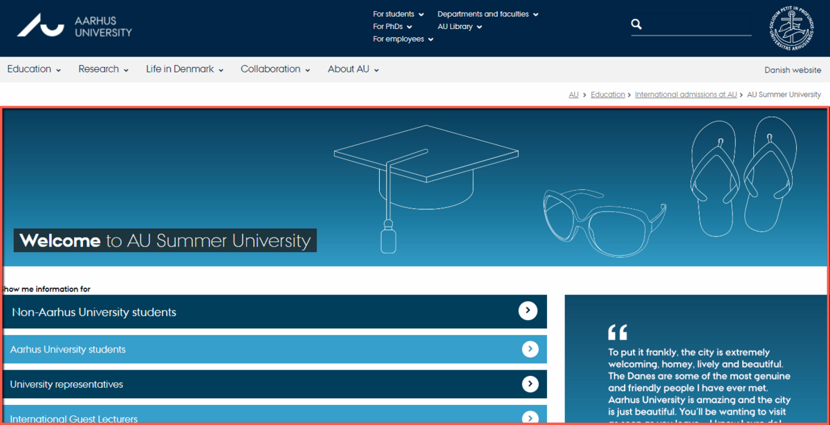
AU MAIN 2016 [No left menu, no right column]
This layout has neither a left menu nor a right column and is primarily used for homepages of web universes.
If you use this layout, users will not be able to navigate to subpages via a left menu. Therefore, you should consider whether the purpose and usability justify choosing this template.
Column elements in the content area
After selecting the page layout, you can divide the central content area (Main column) using one or more grid elements. You can choose between 2, 3, or 4 columns. The column elements can be found under the 'Grid Elements' tab when adding a new content element. You can read more about, how the column elements behave in responsive design.
