How to create buttons
When you want to prompt an action and guide the user to new content — such as another page, a form, or something else — you can do so with a button.
Buttons on the web act as links but with increased visibility. It is always a matter of judgment whether a standard link or a button best supports the action you want the user to take on your page.
You can create buttons in four sizes, 12 different colors, and choose from 32 icons and a right-aligned arrow. You can also decide whether the button will have text or not and adjust its width as needed. With so many options, there is a risk of confusing users with buttons of different colors and sizes.
We recommend keeping the button's appearance as simple as possible to avoid confusing the user. It should be short, precise, and clear about what the button will do.
If a button is not suitable, you might consider using other tools, such as a banner element.
Embed the button element
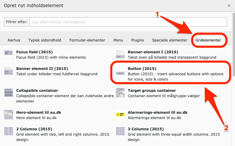
Create a new element on the page where you want to insert a button.
- Switch to the Grid Elements tab.
- Select Button (2015).
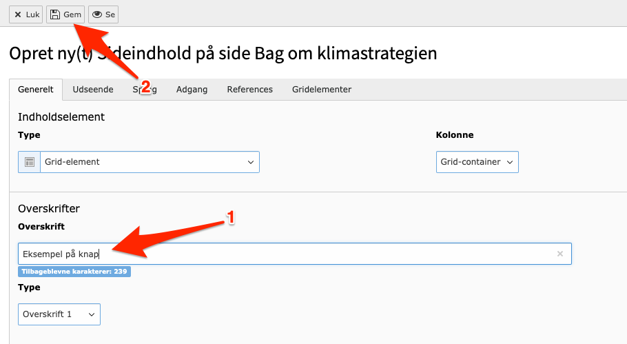
- Name your element by filling out the title.
- Click Save.
Adjust button element
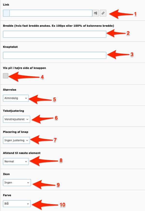
A button element can be adjusted in various ways. Below, we’ll cover the options:
-
Insert Link: Add the URL of the page to which the button should lead. If no link is provided, the button will not be displayed.
-
Button Width: By default, the button's width adjusts to fit the length of its text or content. You can specify a different width in percentage or pixels—for example, 100% of the column width where the button is placed or 150 px.
-
Button Text: Enter a short and precise text for your button.
-
Arrow Icon: Choose if you want an arrow to appear on the right side of the button.
-
Button Size: Select the button size: Large, Medium, Small, or Smallest. See the sizes in the examples below.
-
Text Alignment: Decide on the alignment of the text on the button: Left-aligned, Centered, or Right-aligned.
-
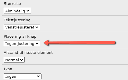
Button Alignment: If the button does not occupy 100% of the column width, choose whether the button should be Left-aligned or Right-aligned. Note: If the button is a regular page element, it is strongly recommended to choose 'No alignment'. Both Left-aligned and Right-aligned make the button a floated element, which can cause subsequent elements on the page to not display correctly.
-
Spacing to Next Element: Choose whether the spacing to the next element should be small or normal.
-
Icon Selection: Choose from 32 different icons for your button. Always assess whether the icon is appropriate for the button’s purpose. If it is not, do not use an icon. See the list of available icons below.
-
Button Color: Select from 12 colors for your button. View some of the colors in the examples below.
Recommendations for button colors
It is recommended to maintain a moderate color scheme for buttons. If possible, it is advantageous to use a color that guides the user and signals something recognizable.
For example, green is typically used to indicate studerende.au.dk, as it represents AU's green universe. Cyan-colored buttons signal medarbejdere.au.dk, as that univers uses this color, while phd.au.dk is purple. On externally facing pages — such as– au.dk, external institute pages, etc. — dark blue and gray are often used, while the Gymnasieportalen uses yellow and brown, etc.
Overview of icons
Buttons that hide subsequent content
If you have placed a button above other elements and selected Right-aligned or Left-aligned for your button, the other elements below it may disappear.
Choose No alignment for button placement to make the elements below the button appear again.
Buttons that pop out of elements
If you have embedded a button at the end of a container, that functions as a collapisble element, the button may end up positioned outside of the element.
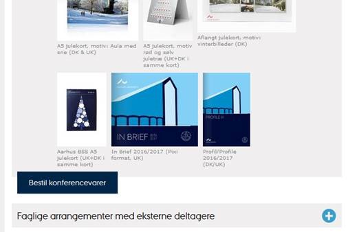
Currently, the only solution is to insert an empty element in the container after the button. This will ensure that it remains within the gray background.
