Focus fields
Focus fields
Using images and other graphic elements can often make a website appear more inviting.
Read here how focus fields can help you.
A focus field is a combination of an image and text. It appears as shown in the example above.
When using graphic elements on a page, you need to balance form and content. Does the graphic element serve a purpose for the user, or is it merely decorative? The page should be inviting, but users are typically there to find specific content.
When using a focus field at the top of the page, it may be a good idea to remove the page's heading/title, which often becomes redundant just above the focus field. You can do this in Edit page properties under the General tab by checking the Hide page heading box.
Embed focus fields
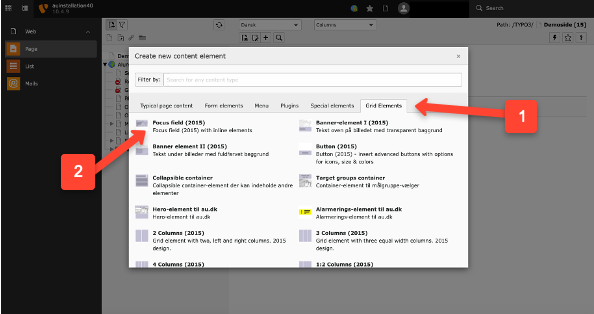
Focus fields are embedded like any other elements.
-
Select the Grid elements tab.
-
Choose Focus field (2005).

Embed content
-
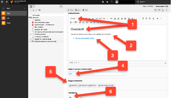
Write your text in the format Heading 1, which is selected from the drop-down menu. The heading can span two lines, but make it as brief as possible.
-
Optionally, write a short text if you need to provide further details about your heading.
-
Optionally, insert a link if you need to refer to other content. We recommend placing your link at the bottom of the focus area and giving the link a distinct background color (see point 6), as this is the standard way to create links in focus areas. To add a background color to the link, format the link text as a bullet point in a list.
-
Select the height of your image. The height is specified in pixels. Use the standard heights of 270 or 350 px if possible.
-
Insert your background image from the file list or upload it directly. Ensure the image is sufficiently large, but no more than 1400 px in width. If the image is too large, it will automatically be cropped from right to left. This doesn’t always look good, so we recommend cropping your background image before uploading. See examples of image dimensions for different page layouts.
- Choose the color for the background of your link.
