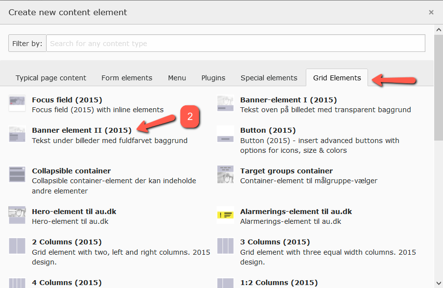
Banner element II (solid color background)
The banner element is a tool in the toolbox that serves as a supplement to the focus area and buttons. Unlike the focus area, the entire banner element functions as a link, making it easier for users to notice that there is something to click on. Compared to a button, the banner element visually occupies more space, so users are more likely to see it.
In practice, the banner element works particularly well in two situations:
-
On so-called landing pages, where the primary purpose is to guide the user to subpages. See an example here: www.au.dk/evu/generel-information/ (banner I)
- As a reference to other content that might be relevant for the user to view after the content on the current page. For instance, the banner can be placed in the right column or in a row at the bottom of the page. See an example here: bss.au.dk/forskning/ (banner II)
Be mindful of the mobile version
The size of the banner element depends on the dimensions of the image you use. The banner is flexible and scales to fit mobile phones and other smaller platforms. However, there is a risk that it may not look good on small screens. Generally, the taller your image is, the more text it can accommodate — also on smaller screens.
How to create Banner element II
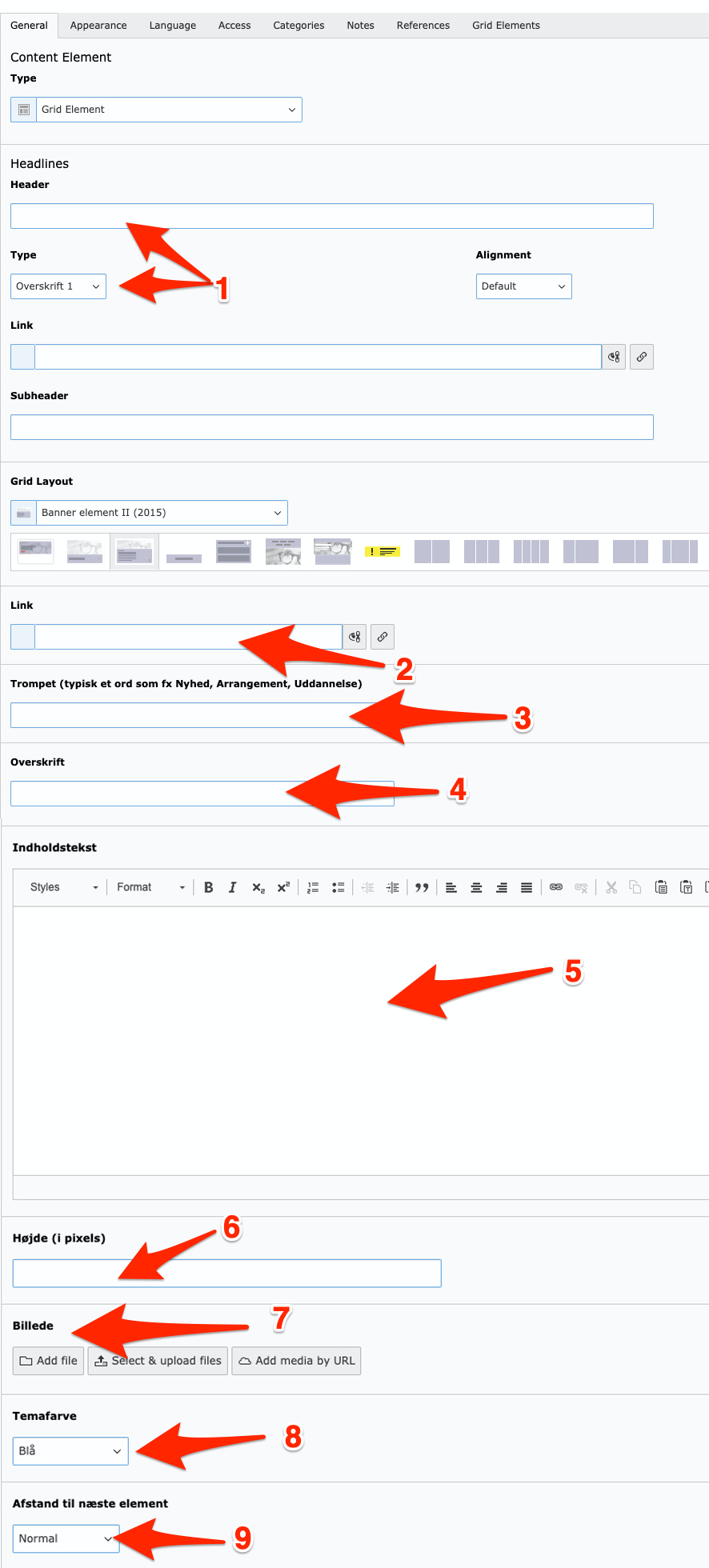
3. Fill in the following fields:
-
Header: It’s a good idea to give the element a title so it’s easy to find if you need to link to it or retrieve it from the trash. The title is not visible in the frontend.
-
Link: Insert the page that the banner element should link to. This should be in the form of a web address (e.g., au.dk) or a page ID (e.g., 121721).
-
Subtitle: Here you can insert a short text that appears above the headline in the banner. The font size is smaller than that of the headline.
-
Headline: Enter the headline for the banner element.
-
Content Text: Write a text that will appear below the headline in the banner. Be cautious with line breaks, as they may not always look good on small screens. Do not insert links in the content text because the banner already functions as a link.
-
Height: If you are placing multiple banner elements side by side, you can set a fixed height for the text field to ensure all banner elements are the same size, e.g., 250 px (Note that you should not write 'px' after the number). This assumes that the height-to-width ratio of the images is the same if you are using images. If your text exceeds the specified height, it will ignore the specified height. Remember that the text takes up more space relative to the image when the banner is displayed on a mobile phone, so check that it looks good on a small screen as well. If you do not specify a height, the box’s height will follow the amount of text and will automatically adjust on mobile to fit everything.
-
Image: Banner element II works with or without an image. It’s optional to upload an image for your banner. Never upload an image wider than 1400 pixels.
-
Theme Color: The element is available in 12 color variants.
-
Spacing to Next Element: You can choose whether the spacing to other elements should be small or normal.


