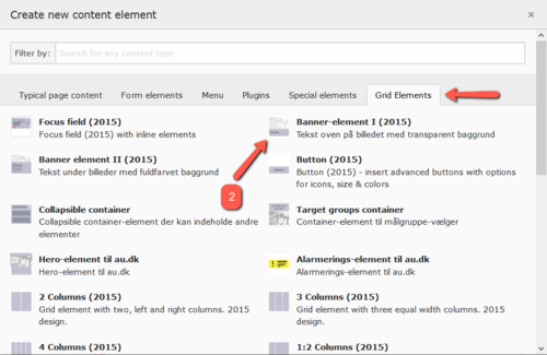
Banner element I (transparent text field)
The banner element is a tool in the toolbox that serves as a supplement to the focus area and buttons. Unlike the focus area, the entire banner element functions as a link, making it easier for users to notice that there is something to click on. Compared to a button, the banner element visually occupies more space, so users are more likely to see it.
In practice, the banner element works particularly well in two situations:
-
On so-called landing pages, where the primary purpose is to guide the user to subpages. See an example here: www.au.dk/evu/generel-information/ (banner I)
- As a reference to other content that might be relevant for the user to view after the content on the current page. For instance, the banner can be placed in the right column or in a row at the bottom of the page. See an example here: bss.au.dk/forskning/ (banner II)
Be mindful of the mobile version
The size of the banner element depends on the dimensions of the image you use. The banner is flexible and scales to fit mobile phones and other smaller platforms. However, there is a risk that it may not look good on small screens. Generally, the taller your image is, the more text it can accommodate — also on smaller screens.
How to create Banner Element I
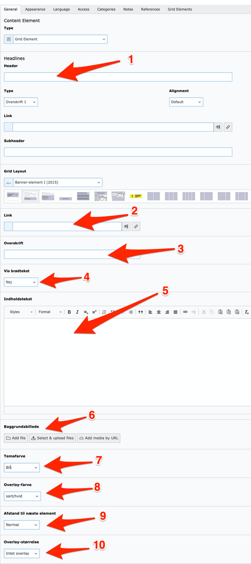
3. Fill in the following fields:
-
Header: It’s a good idea to provide a title for the element, even though the title is not visible on the frontend. Having a title makes it easier to find the element in the backend, in the trash, or if linking to it (using global content, for example).
-
Link: Insert the URL or page ID that the banner element should link to (e.g., au.dk or ID 121721).
-
Headline: The headline for the banner element (displayed on the frontend).
-
Show body text: Choose whether or not to display the body text.
-
Content text: Enter the body text here. Be cautious with line breaks, as they might not look good on small screens. Do not insert links in the body text, as the banner already functions as a link.
-
Background image: The size of the uploaded image determines the size of the banner element. If no image is uploaded, a default placeholder image will be used. Never upload an image wider than 1400 pixels.
-
Theme color: You can choose from the base colors: blue, purple, green, cyan, and turquoise.
-
Overlay color: The three overlay variants offer different appearances depending on the theme color selected.
-
Spacing to next element: Choose whether the spacing to other elements should be small or normal.
-
Overlay size: If you want some of the image to be visible, choose an overlay size of 33% or 50%."
Ok text length in relation to image size on mobile screen:
Desktop

Mobile

Too much text in relation to image size on mobile screen:
Desktop

Mobile


