Image slider
Image slider allows you to create an image element where the user can either manually switch between images, or the images change automatically. This creates an effect similar to a carousel or slideshow.
Here’s an example of what an image slider looks like:
Place image slider
The image slider is embedded like any other element
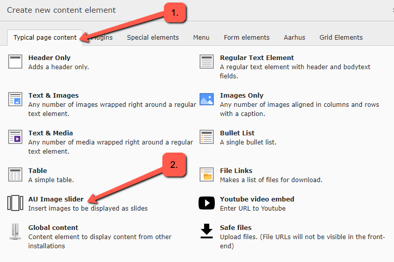
1. Select Typical page content
2. Select AU Image slider

Select images and settings for the image slider
When adding images, they should be at least in the format 1920x1160 px. The images are scaled to a width of 2000px and cropped to a height of 1130px. You can add as many images as you like. See the next section for how to add individual images.
Be sure to crop the image in a way that the central part of the image is as centered as possible, as this will yield the best results.
-
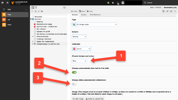
Select the color scheme here.
-
You can choose to have the image slider automatically loop from the last to the first image, so it restarts automatically when the user reaches the last image.
-
You can choose whether the images should change automatically. If you select this, you can set the number of seconds between each image change.

Add images
When you add an image, you will have some specific options for that image.
-
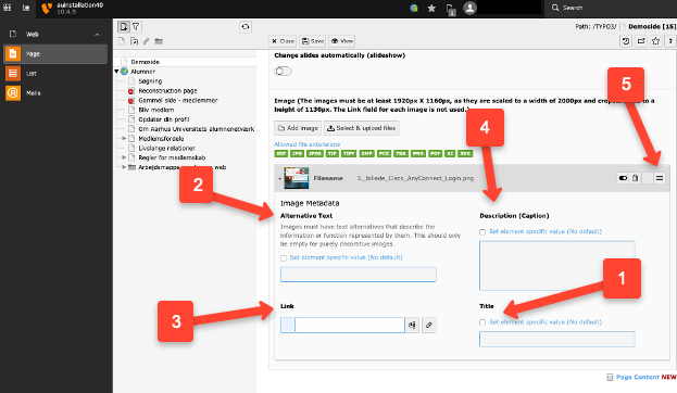
Title is usually left blank as it will not be displayed in the final result.
-
Alternative text is shown when you hover the mouse cursor over the image and is used by visually impaired users. This function is for describing the content/information of the image.
-
Link should not be filled in.
-
Description is displayed as a caption for the image.
-
By dragging the three lines, you can rearrange the order of the images.


